

Drawing for watercolor painting - what is an underdrawing and do you need one?
Drawing is the first stage of watercolor painting - so pretty important! Let’s find out what an underdrawing is and whether you actually need one.
I have lots of tips about drawing for watercolor painting to share with you - so let’s get started!
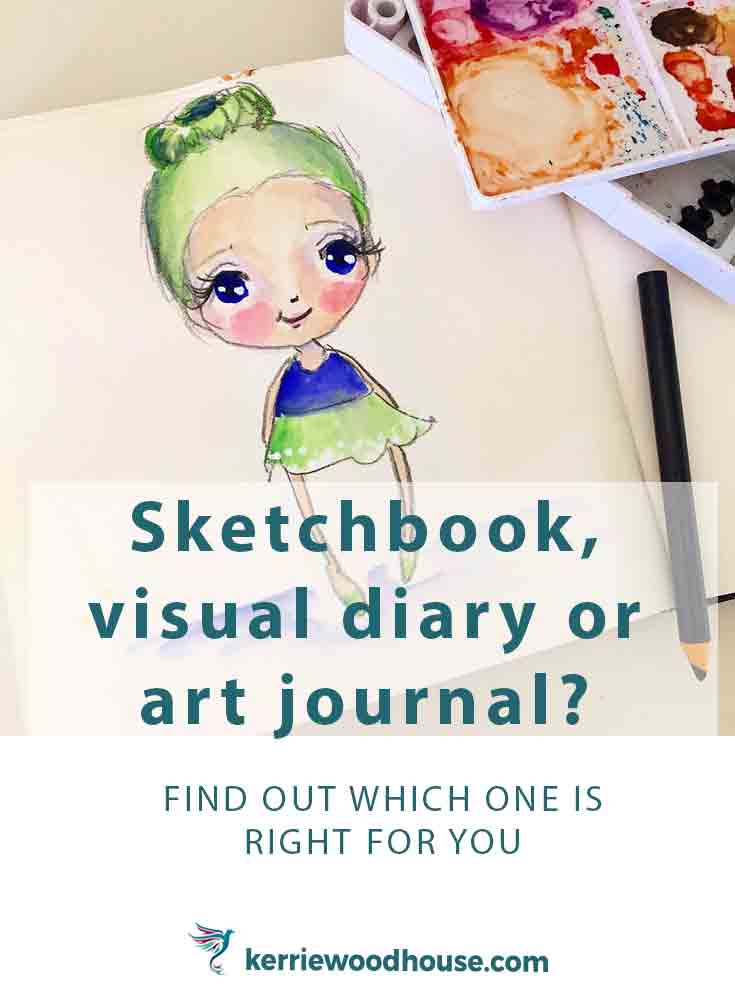
Sketchbook, visual diary or art journal?
So. sketchbook, visual diary or art journal… what's the difference?
Which one should a beginner take up?
Let’s investigate and find out which one is right for you.

Do You Need to Draw to Paint?
If you want to paint with watercolour, do you need to be able to draw?
Well, in short no.
But why wouldn’t you want to?
There are a few options available to get you painting even if you feel you can’t draw yet, which we’ll discuss.
But please know that being able to draw provides a satisfaction that is hard to beat. (And it’s really not as hard as you may think.)
Let me explain.

Is Tracing Cheating in Art?
Do you consider tracing to be cheating in art?
That’s a question I have heard a few times before. It makes me chuckle.
Cheating who exactly, I always want to say?
Let’s figure out when and if tracing might be useful to your art practice and then discuss the advantages and disadvantages of tracing.

How to turn a simple line drawing into an easy watercolour painting
Watercolour painting needn’t be complicated - in fact sometimes it doesn’t take much more than a simple line drawing.
This comes in handy rather often, for instance…

What is an Art Collaboration and Should You Participate in One?
If you are feeling a little creatively stuck, find yourself procrastinating in your lonely studio and struggling to make art, then an art collaboration might be just what you need.
Let’s talk about exactly what an art collaboration is and what benefits it might have for you.

Art Challenges - Pros, Cons and How to choose the best challenge for you
There are a lot of good things about art challenges, but let’s be honest - that is only half the story.
Before diving into an art challenge you might want to consider these pros and cons of art challenges and how best to make an art challenge work for you.
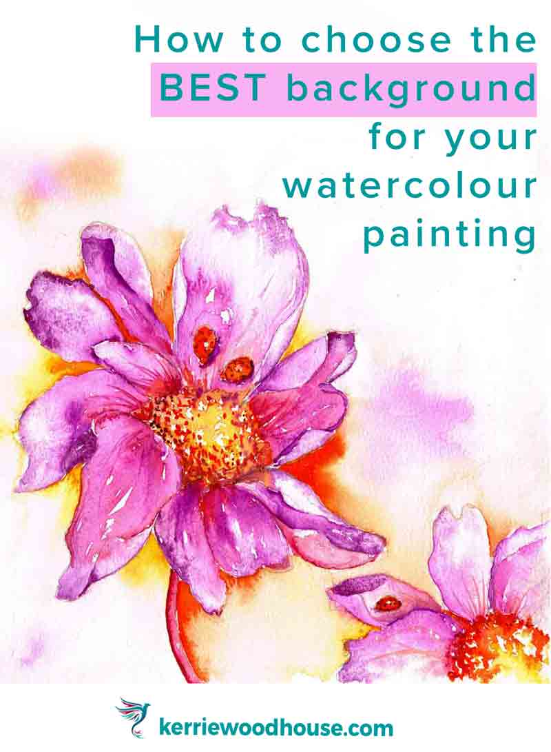
How to add a watercolour background to your paintings
Choosing the right background for your watercolour painting can make or break the whole painting.
Don’t be alarmed though - even though the background is important, it doesn’t have to be complicated. There are lots of options available to you and once you know what there is to choose from I am sure you will find the whole process far less vexing than it might once have appeared.
Let’s review your options…
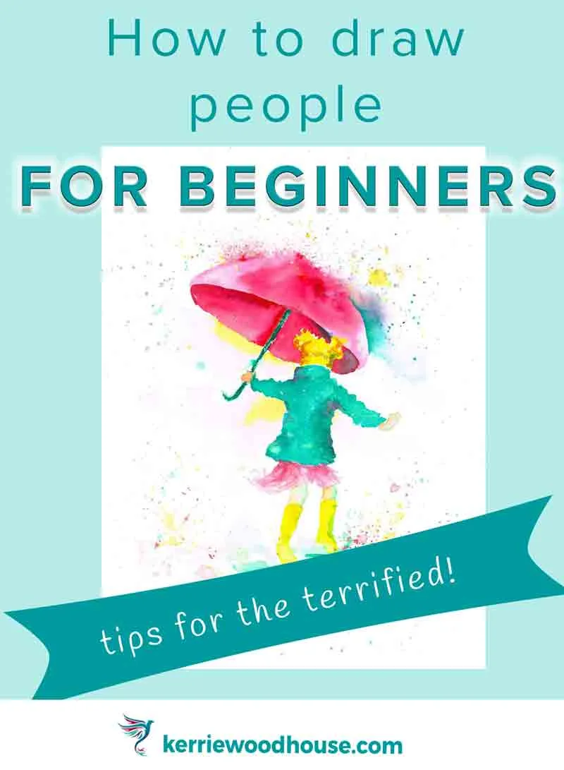
How to draw people for beginners (to add to your paintings)
Learning how to draw figures for beginners can be something of a daunting challenge. If we are honest, it's not just beginners - I have met quite a few experienced artists that still have some reservations about drawing and painting a human figure.
I have a few tips for the terrified to get you on your way, if you think you fall into this camp.

How to paint a portrait in watercolor
Ever thought about having a go at a portrait in watercolour?
Good thinking… and these 10 tips for beginners are sure to get you off to a flying start.

Painting farm animals with spirit (and watercolour)
I know we understand each other. It means I can talk freely about my online class addiction. Phew. So this month, I took another class with Miriam from the Inspiration Place. It was called 'Farm Animal Spirits'. I'm not sure I really got what Miriam meant by this initially. I was more than happy to just start painting cute little farm animal babies... like these adorable little balls of fluff

7 Things You Need to Know about Drawing in Perspective
Being able to add perspective to your drawings instantly adds a touch of realism and invites the viewer into your picture. But when you are starting out, learning about perspective can seem terribly daunting.
Here are 7 things you need to know about drawing in perspective that might help.

